Your player is what viewers see wherever a video appears, on its share page and in every embed. Player Controllers let you decide which controls that player offers. You will find them in three places: your workspace defaults, a single video's settings, and a playlist's settings. Your defaults cover the general controls applied to every new upload, while a single video or a playlist gives you the full set, including controls that appear only when they apply, such as captions and chapters. They work the same way wherever you set them.
You set your player's colours, the brand colour and secondary colour, in Brand Style. For what each one does and how overrides work, see Setting your default branding and Branding a single video or playlist.
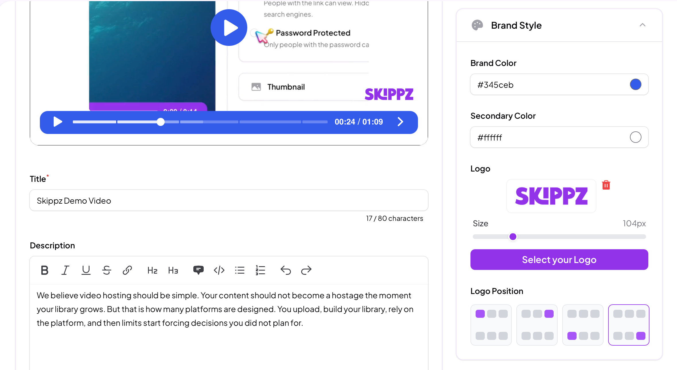
To add a logo watermark, open Brand Style and click Select your Logo. You can pick a logo you have already uploaded to your library or upload a new one. The Size slider sets how large it sits on the video, and Logo Position places it in one of four corners.
One thing that catches people out: if you cannot see your logo, or nothing changes as you adjust its size or position, the Logo toggle in Player Controllers is almost certainly off. Expand the Player Controllers section, switch Logo on, and your watermark appears straight away at the size and position you chose.
Each toggle decides whether viewers see that control. A couple of them appear only when they are relevant, which is noted below.
Progress Bar lets viewers see the video's length, where they are up to, and seek to any point. If you switch it off, your other enabled controls still appear, gathered into a compact control bar on the right of the player.

Volume lets viewers adjust the sound or mute it.

Video Quality lets viewers choose a playback quality by hand. Your player already serves the best quality automatically across all embeds and share pages, so this simply adds a manual override on top.

Speed lets viewers slow the video down or speed it up, from 0.25x upward. It is a helpful accessibility option.

Captions appears only once a video has captions, whether you added them yourself or generated them. Switching it off hides the caption control from viewers while keeping the captions stored, so you can bring them back any time. More in AI Captions.

Chapters appears only once a video has chapters. Like captions, switching it off hides chapters from viewers without deleting them, they stay stored and ready to switch back on. More in AI Chapters.

Picture in Picture is off by default. Switch it on and viewers can pop the video out into a small floating window that stays on top while they scroll the rest of your page or move around their browser, so they keep watching while they read.

Fullscreen lets viewers expand the player to fill their whole screen for a focused watch, then return to the page. Most viewers expect this, so it is on by default.

Logo shows your watermark on the player, as covered above.

In a playlist, captions and chapters apply per video. If you switch them on for the playlist, they show only on the videos that actually have captions or chapters added. Any video without them simply plays without that control, while the rest of the playlist keeps it.
Beyond these on or off controls, the player has a few more playback options, such as autoplay and casting. Those have their own settings, covered in Additional playback settings.
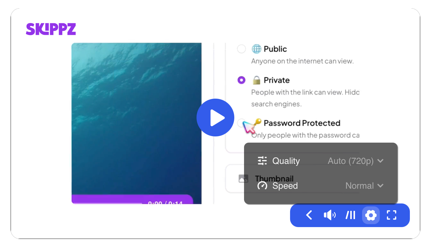
Speed and Video Quality sit under the gear icon rather than on the main control bar. These are occasional controls, so tucking them into the settings menu keeps the main bar uncluttered and tidy across different player sizes and devices, while the controls people reach for most, play, seek, volume and fullscreen, stay one tap away.
The player inside the app is there to help you set things up, and it is not always a pixel perfect preview of the final result. Some controls are toned down in places like the embed drawer because they would not sit well there, even though they show correctly to your viewers. For example, the full chapter content does not render on the in app media view, though the chapter breakdown does.
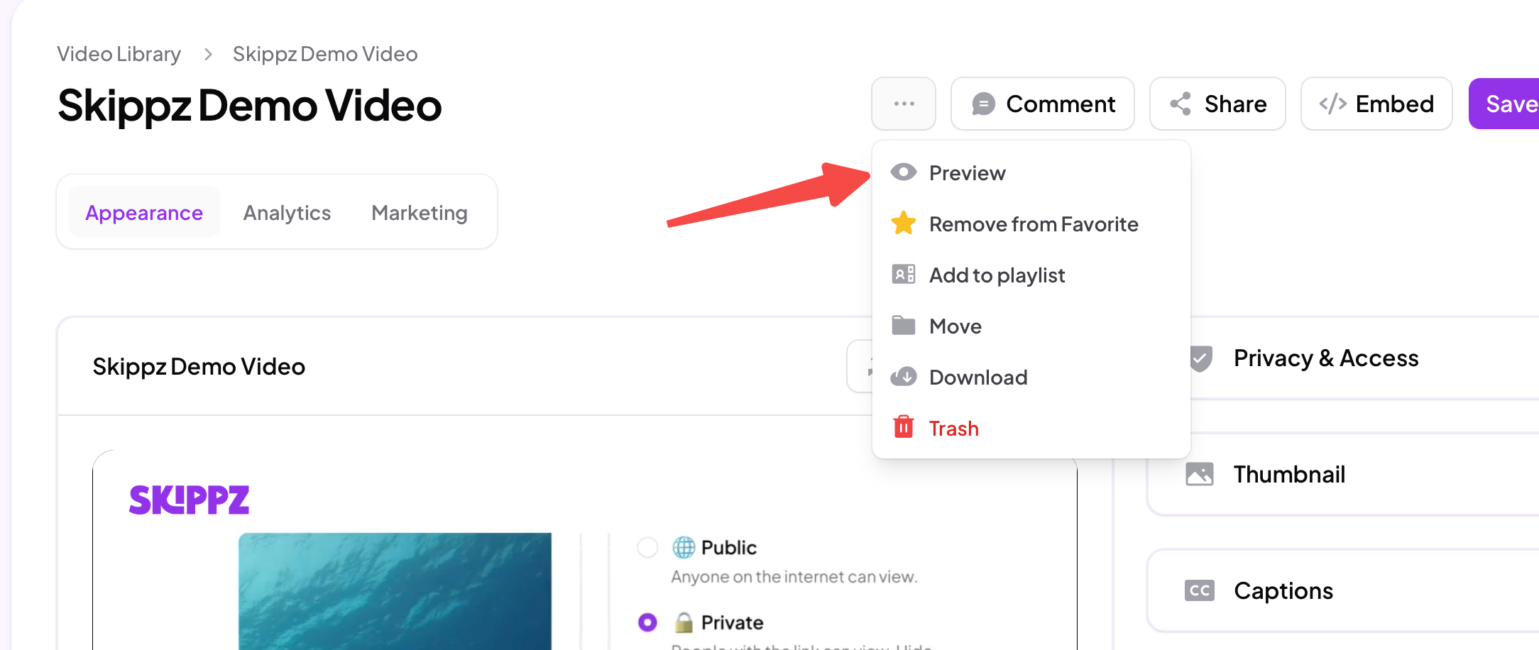
To see exactly what a viewer gets, use Preview, or open your share page or embed. That is always the accurate view of your player and its settings.
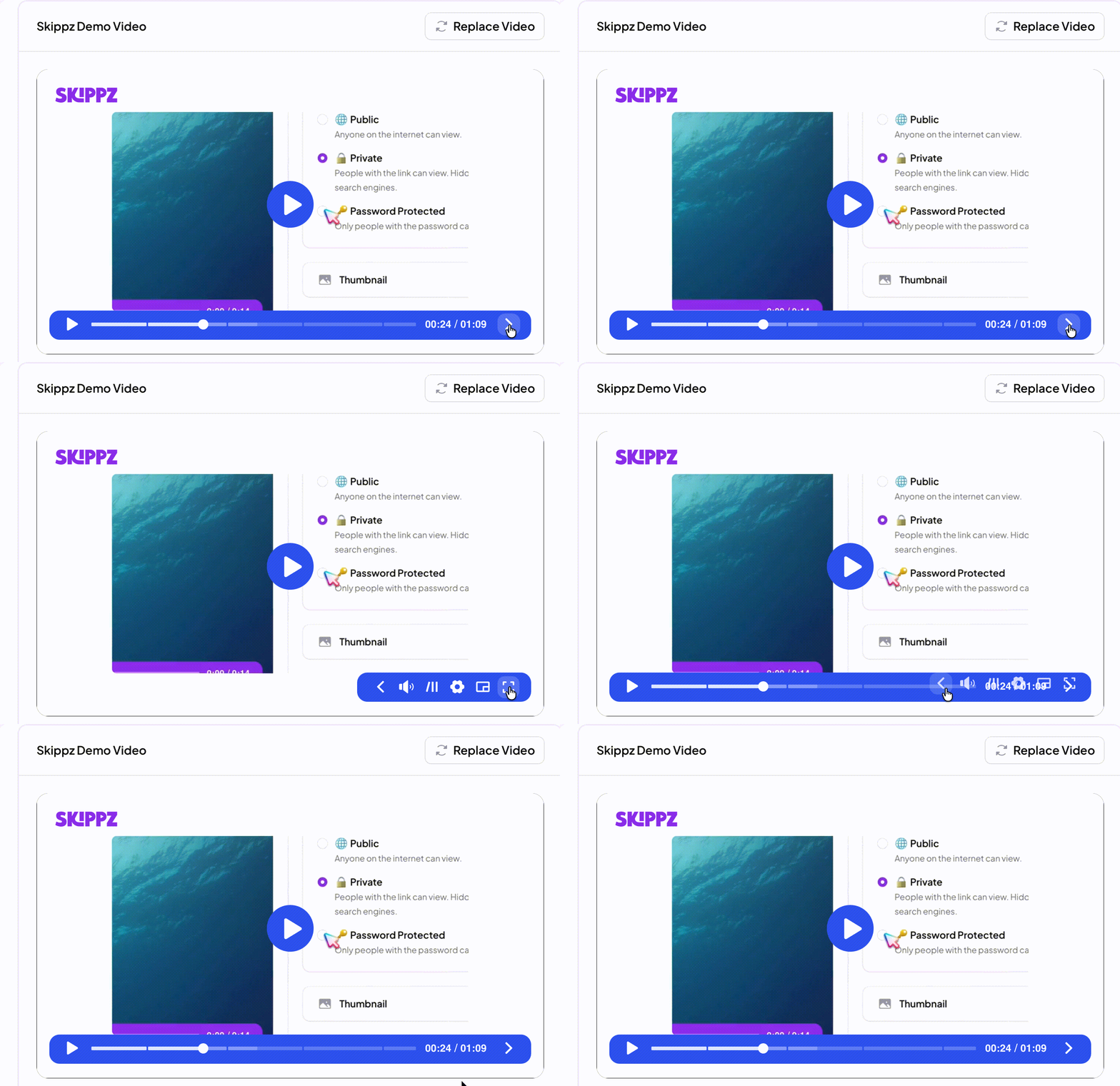
Our player is built to be responsive, and we update it continually because we take it seriously. When a lot of controls are enabled and the player sits in a small embed container or on a smaller screen, they may not all fit at once. Rather than crowd them, the player tucks the extra ones behind an arrow. Viewers tap the arrow to reach the rest of the controls. This is a deliberate, standard way to keep the player clean and usable at any size.
Additional player settings
Captions
Chapters